Choosing Fonts & Lettering Styles for Ambigrams
Picking the right font or lettering style is half the battle. This guide shows which families and features make ambigrams easier—and how to avoid the traps that ruin readability.
If you’re brand-new to the concept, start with The Ambigram Guide for Beginners and Types of Ambigrams. When you’re ready to build reliable results in our generator, use the checklists and examples below. If things go sideways, jump to Fixing Failed Ambigrams and the Ambigram Readability Guide.
What makes a font “ambigram-friendly”?
1) Symmetry affordances
- Lots of letters can mirror/rotate cleanly (O, H, I, X, S, Z).
- Diagonals are balanced (A, V, W, Y not too lopsided).
- Terminals and serifs don’t create lopsided weight after rotation.
2) Stroke contrast
- Low contrast (monoline) survives flips best.
- High contrast (Didone/Modern) often collapses at small sizes.
3) Counters & apertures
- Open counters (a, e, g) remain legible when mirrored/rotated.
- Tight apertures muddy quickly—watch the “a/e/s” trio.
4) Join behavior
- Easy ligatures (r+n, t+i, c+l) let you “bridge” problem spots.
Style families ranked by ease (from easiest to trickiest)
1) Geometric Sans (easiest)
Examples: Futura-like, Montserrat-like, Poppins-like
- Why it helps: Circular O, straight stems, predictable geometry.
- Use when: You want dependable rotational results or clean mirror work.
- Watch for: Overly circular a/e can read as blobs when small—open them up.
2) Grotesk / Neo-Grotesk Sans
Examples: Helvetica-like, Inter-like
- Why it helps: Neutral forms, good spacing for ligatures.
- Use when: You need brand-friendly, modern ambigrams.
- Watch for: Some grotesks have cramped counters; track out a bit.
3) Slab Serif
Examples: Rockwell-like, Roboto Slab-like
- Why it helps: Thick slabs act like monoline strokes; shapes stay coherent.
- Use when: You want sturdier reflective ambigrams or badge-like logos.
- Watch for: Heavy slabs can fuse at small sizes—test at thumbnail scale (see Ambigram Readability Guide).
4) Monoline Script
Examples: Sign-painting, rounded brush with even weight
- Why it helps: Natural ligatures rescue tricky pairs (r+n, s+t).
- Use when: You’re stylizing names or symbiotograms (two different words).
- Watch for: Over-curly terminals can obscure letter identity.
5) Humanist Sans
Examples: Gill-like, Calibri-like
- Why it helps: Friendly, open apertures.
- Use when: You need warmth without losing structure.
- Watch for: Irregular stroke angles can break rotational symmetry.
6) Blackletter / Fraktur (advanced)
- Why it helps: Vertical symmetry, dramatic negative space.
- Use when: You want ornamental or gothic moods.
- Watch for: Spiky terminals create noise after rotation; simplify ruthlessly.
7) Didone / Modern Serif (trickiest)
Examples: Bodoni-like, Didot-like
- Why it hinders: High contrast flips poorly; thin hairlines disappear.
- Use when: You’re committed to editorial luxury and can redraw glyphs.
- Watch for: Hairlines—thicken or “fake-slab” them when necessary.
Matching symmetry to style
Rotational (180°)
- Start with Geometric/Grotesk sans or Slab.
- Favor letters that self-map on rotation (O, S, Z, H, I, X) and friendly swaps (n↔u, m↔w, p↔d, b↔q).
- Keep vertical proportions consistent so the upside-down form doesn’t “shrink.”
Reflective (mirror)
- Slab and Geometric shine—clean verticals mirror nicely.
- Palindromes are easiest, but letter-swap tricks (b↔d, p↔q, m↔w) can unlock non-palindromes.
Symbiotogram (word A → word B)
- Monoline script is forgiving for custom joins.
- Use Symbiotogram: Ambigram Complete Guide for pair-planning, then return here to pick a style.
Practical “chooser” flow (copy this)
- Pick symmetry (rotational / mirror / symbiotogram). See Types of Ambigrams.
- Select style: Geometric or Slab if unsure.
- Scan your letters: Do you have many diagonals (A, V, W, Y) or closed bowls (a, e, g)?
- Decide case-mix: Mixed case often rescues pairs (e.g., aNnA).
- Plan ligatures: Mark likely bridges (r+n, t+i, c+l).
- Draft → flip → repair: After every change, rotate/mirror and fix counters first.
- Size audit & export: Test tiny/normal/large; then save SVG + PNG. See Export & Usage.
Case mixing: when upper/lower saves the day
- Lowercase gives rounder bowls (good for rotation).
- Uppercase gives cleaner axes (good for mirrors).
- Try Title Case to exploit both: e.g., NooN, LovE.
- If a letter breaks in one case, try the other (particularly a/e/g/r).
Ligature patterns that frequently help
- r + n, r + m, t + i (share a stem or overbar)
- c + l, c + t (tighten spacing; extend terminals)
- s + w, s + h (let the s tail become the next stem)
- o + anything (o as a “hinge” for rotation)
If your join makes a blob, reopen the counter before tweaking terminals. See Fixing Failed Ambigrams.
Common pitfalls (and quick fixes)
- High-contrast serif collapsing at small sizes → Switch to slab or thicken hairlines.
- Mirrored diagonals look uneven → Re-angle strokes so left/right weight matches.
- Closed counters after rotation → Expand apertures; add inner ink-traps.
- Serifs causing noise in rotation → Shorten or square them; consider “semi-slab.”
- Over-tight kerning → Add a touch of tracking before you judge readability. See Ambigram Readability Guide.
When to letter by hand (instead of choosing a font)
- You need perfect bilateral symmetry that no font delivers.
- You’re building a tattoo where micro-balance on the body matters (curvature, placement). See Ambigram Tattoo Guide.
- You want a brand mark with unique ligatures or cultural motifs.
Draft in monoline first, then add contrast only where it won’t break the flip.
Quick recipes
- Minimalist logo, rotational: Geometric sans, mixed case, O/X as anchors, thin slab “helpers” if needed.
- Badge or coin, mirror: Slab serif, all caps, tighten verticals, test at small sizes.
- Names, symbiotogram: Monoline script, lean on ligatures, keep joins above/below baseline to separate words.
Examples gallery (tap to rotate)
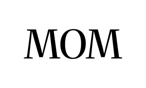
Geometric sans: clear bowls and straight stems help rotational balance
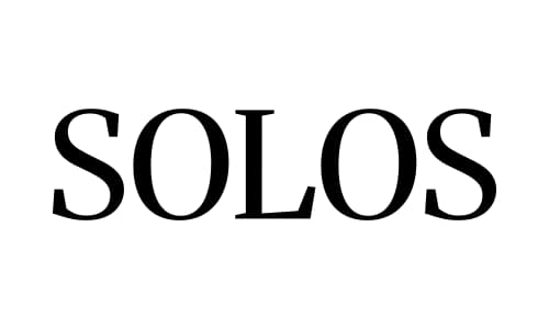
Slab serif: sturdy terminals remain coherent at small sizes
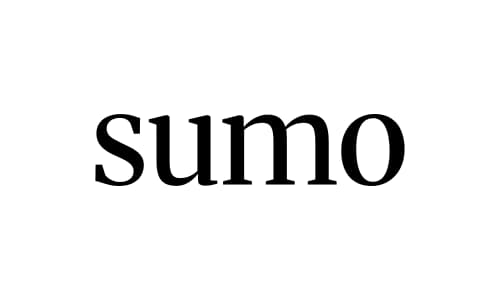
Monoline script: flexible ligatures can bridge tricky letter pairs
Tip: Always test readability at thumbnail sizes (24/48/96px). If counters close up after rotation, reopen them before tweaking terminals.
FAQ
Q1: Do I need a commercial license for the font? A: If you’re exporting a logo or tattoo design derived from a commercial font, check its license. When in doubt—or for resale—customize heavily or draw from scratch.
Q2: Why did my serif ambigram look perfect large but messy small? A: Hairlines vanish at small sizes. Either increase minimum stroke thickness or switch to a slab/monoline approach. See Ambigram Readability Guide.
Q3: Are display fonts a bad idea? A: Not always, but they’re risky. Use them only after a monoline draft proves the letter logic works.
Q4: Can I mix fonts? A: Yes—many successful ambigrams blend a monoline base with slab-like terminals. Keep the flip clean and consistent.
Q5: How do I know if a style will work before I invest hours? A: Prototype the hardest pair in your word (e.g., R↔G). If you can solve that legibly, the rest will likely follow. Otherwise, change style early.
Q6: What export formats are best? A: Keep a master SVG for edits and perfect flips, plus PNG for previews. Workflow tips in Export & Usage.
Ready to try? Draft in a forgiving style (Geometric/Slab), test flips as you go, and generate your base on our generator. If you hit a wall, the triage flow in Fixing Failed Ambigrams will get you unstuck fast.